You know the value of a good marketing plan if you own a business. And advertising your business is essential to creating a successful one.
From social media targeting to print advertisement, there are a lot of advertising avenues you have at your disposal today. A powerful marketing tool to add to your toolbox is custom banners.
With so many advertising options and channels, it can be easy to get overwhelmed and confused. Here are some common errors with custom banners and how to avoid them.
Table of Contents
1. Incorrect Color Matching
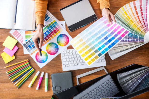
It could make the logo’s colors, like shades of yellow or blue, not appear correctly on the desired material. To avoid this error, one needs to use the appropriate Pantone colors. Additionally, you must select suitable fabric or vinyl materials to ensure the colors for banners remain the same.
Use the best printing methods to get the right colors.
2. Forgetting Professional Graphic Design Guidelines
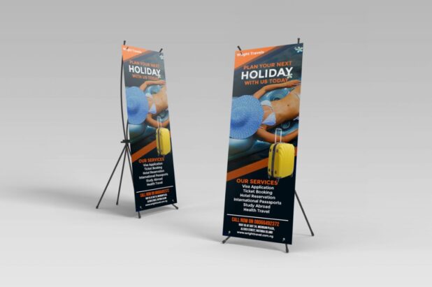
Banners should have a unique focal point and include prominently displayed words that can be easily read.
Additionally, it is essential to include images or designs relevant to the banner’s message. Neglecting to follow design principles such as these can result in an ineffective or confusing banner.

3. Incorrect Spelling/Grammar
It would help if you proofread your banners multiple times and carefully check for any errors. Also, it is advisable to use a spell checker and grammar checker to double-check your banners. Finally, have someone else review your banners to ensure correct spelling and grammar.
4. Including Too Much Text
Including too much text on banners can be a common issue and one of the most challenging errors to correct. When using a reader, the idea is to ensure that whatever the message is, you can understand it in just a few moments. More text is needed to be easier to read and can clutter the design.
To prevent this error, distill the text down to its simplest form. Choose words wisely and cut anything that isn’t necessary. Remember, good banner design should be eye-catching, not overwhelming.

5. Incorrect Sizing
Most projects require exact measurements, and anything less can result in a banner that is distorted, torn, or too small to work. Therefore, measuring your banner before ordering is essential to ensure it fits the space allocated.
You should know the correct measurements before creating your artwork. Be sure to consider additional allowances such as mounting, borders, or containers that could affect the overall image and size.
6. Any Resolution Issues
Common mistakes include not accounting for stretching or pixilation if a banner is used with different resolutions and poor font and graphics choices so that they can easily be seen at multiple resolutions.
To ensure that custom banner ideas look great at any resolution, designers should always submit proofs at the specific answer. They should also use high-resolution images, font sizes suitable for all solutions, and clear call-to-actions that can be easily seen across all resolutions.
Common Errors With Custom Banners
However, standard errors, such as incorrect font sizes, spelling, and overly generalized messages, can detract from the intended message. Avoid these errors by double-checking the design, proofreading, and utilizing specific and targeted messaging. Get the most out of your investment in custom banners by avoiding common mistakes with custom banners.
If you’d like to receive more helpful business tips, be sure to check out the rest of our site!
 World Magazine 2024


